
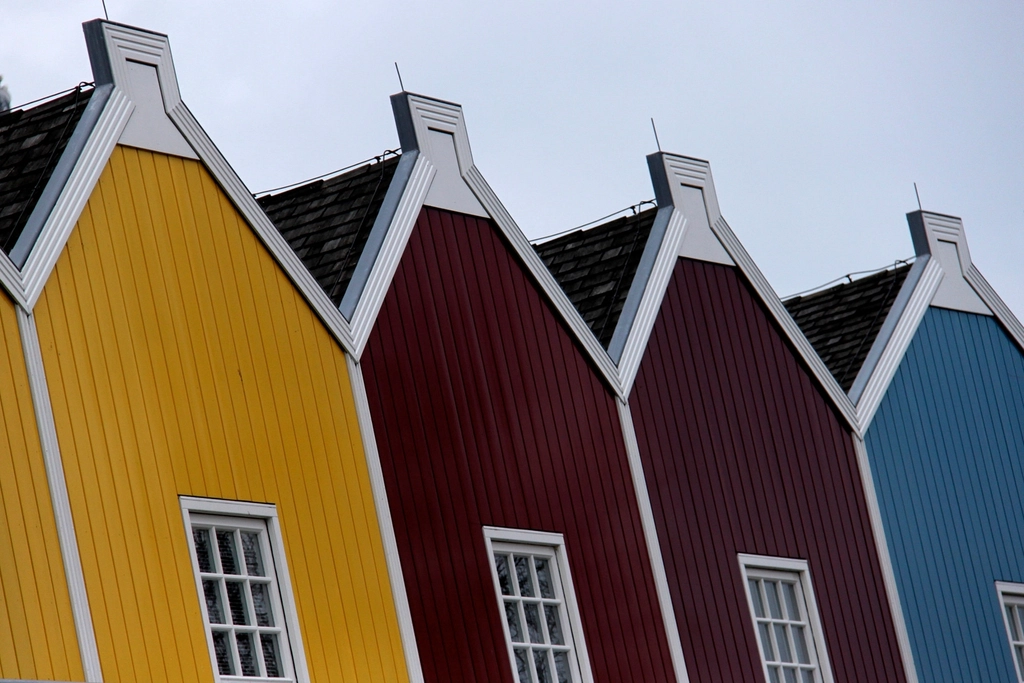
The city as a colour object
Walk down any street and you are looking at hundreds of colour decisions, almost none of which were made together. A render colour chosen by a developer in 2019 sits beside brick fired in 1890, beside a shopfront vinyl printed last month, beside the grey of asphalt that nobody chose at all. Yet the street reads as something: warm or cold, coherent or chaotic, generous or mean. That collective impression is what people mean by an urban palette, and it is one of the few areas of colour work where the specifier controls a fraction of the result and inherits the rest.
Colour in the built environment sits awkwardly between measurement and politics. It is measurable — a facade has a reflectance and a chromaticity like any other surface — but the decision about what colour a building should be is rarely settled by numbers. This article looks at how practitioners survey, specify, regulate and verify colour at the scale of streets and districts, and where the technical tools stop being useful.
Why cities acquire palettes without planning them
Historic urban palettes are mostly geological accidents. Before pigments and stone travelled cheaply, buildings were made from whatever lay within a few kilometres and coated with whatever could be burned or dug nearby. Bath is a particular honey-gold because of its oolitic limestone. Siena is Siena because of the local iron-rich earth. The apparent taste of a place is often just the local mineralogy plus the economics of transport.
Industrial pigments broke that constraint. Once titanium dioxide white and synthetic organic colourants became cheap in the twentieth century, any building could be any colour, and the coherence that came free from geology had to be produced deliberately or not at all. Much of the discipline now called urban colour planning is an attempt to recover, by policy, a coherence that used to be a by-product of supply chains.
Three sources of urban colour
- Inherent material colour. The colour belongs to the substance itself — brick, stone, timber, concrete, weathering steel. It cannot be adjusted without changing the material, and it ages slowly and usually gracefully.
- Applied colour. Paint, render, powder coating, anodising, ceramic frit on glass. This is the layer that gets specified, argued over and repainted, and it is also the layer that fails first.
- Incidental colour. Signage, awnings, vehicles, bins, road markings, planting and people. Typically ignored in design documents and frequently the loudest thing in the actual view.
Surveying what is already there
Serious urban colour work starts with a survey rather than a mood board. The classic method, developed by the French colourist Jean-Philippe Lenclos under the name geographie de la couleur, involves systematically sampling the built and natural materials of a district — scrapings of render, chips of stone, samples of soil and vegetation — and reducing them to an ordered chart of the dominant and accent colours that actually occur there.
Modern surveys add instruments. A handheld spectrophotometer, a device that measures how much light a surface reflects at each wavelength, will give a reliable reading of a flat, matt, clean surface. In practice facades are rarely any of those things, so surveyors combine instrument readings with physical fan-deck matching held against the wall in daylight, plus calibrated photography with a colour reference target in the frame.
- Sample in shade, not sun. Direct sunlight on a facade adds a strong specular and inter-reflection component, and it will pull an instrument reading and an eye judgement in different directions. North-facing diffuse light is the practical standard.
- Record the dirt separately. A soiled facade is not the same colour as the material. Note both the weathered state and, where a sheltered area exists, the protected original, because the gap between them tells you how the specified colour will actually look in ten years.
- Use a notation with a spatial logic. NCS, which describes colours by their perceived resemblance to six elementary colours, is widely used in European architectural practice because architects can reason about relationships in it. RAL is common for coatings and powder finishes. Whatever the system, record the notation and a measured value, not just a trade name.
- Count areas, not just colours. A palette is a set of proportions. A district with three per cent bright red and ninety per cent pale ochre is not the same place as one with those figures reversed, even though both surveys list the same two colours.
Scale changes the colour
The single most common failure in facade colour is choosing from a small chip. A colour applied over hundreds of square metres looks markedly different from the same colour on a 50 mm sample, and the difference is systematic rather than random.
Large areas of a chromatic colour appear lighter and more saturated than small samples of the same paint. The effect is partly a property of the visual system and partly physical: on a big wall, light bounces between adjacent parts of the surface and between the wall and the ground, and each bounce multiplies the reflectance spectrum by itself, deepening the dominant hue. A soft apricot on a chip becomes an assertive orange on a five-storey block.
The practical response is mock-ups. Most experienced specifiers will not sign off an exterior colour without a painted panel of at least two square metres, viewed on site, at the orientation it will be built at, and looked at across a full day. On large projects the mock-up is a whole bay of the real construction, complete with mortar, junctions and reveals, because shadow gaps and reveal depth change perceived colour as much as the pigment does.
Texture compounds the problem. A through-coloured render with a coarse aggregate holds micro-shadows in every pit, which lowers its measured lightness and softens its chroma compared with a smooth coat of the same tint. Two products can match perfectly on an instrument and look plainly different on the wall because one scatters light from a rough surface and the other from a flat one.
Light, latitude and weather
Facades are lit by a source that changes colour continuously. Direct midday sun plus blue sky is a very different illuminant from overcast north light, which is different again from the low, strongly orange light an hour before sunset. A colour scheme that resolves beautifully under Mediterranean sun can look muddy and cold under a Northern European sky, which is one reason imported palettes so often disappoint.
Latitude also affects the geometry of light. In high latitudes the sun sits low, so facades receive proportionally more direct light and roofs less, which historically encouraged stronger facade colour. In hot, high-sun regions the traditional response is high-reflectance whites and pale limes, which is both a thermal and an optical strategy: a whitewashed wall stays cooler and throws a great deal of light back into narrow streets.
Nightfall changes everything again. Streets are now largely lit by LED sources with narrow, engineered spectra, and a facade colour selected under daylight may render very differently under a 4000 K street lantern. Where a building matters at night, the reasonable approach is to view the mock-up under the actual specified lighting product before approval.
Regulation: colour plans and their limits
Several cities regulate facade colour formally. Turin has operated a municipal colour plan since the early nineteenth century, and its restoration in the 1970s and 1980s reconstructed the historic scheme of ochres, yellows and greenish greys from archival research and paint stratigraphy. Various Italian and French municipalities issue piani del colore or nuanciers that restrict permitted colours to a documented local range.
These instruments work well for conservation areas and less well as general policy. They are good at preventing a single loud intervention from wrecking a coherent street. They are poor at accommodating new building types, and they can freeze a place into a picturesque version of one historical moment, which is itself a choice rather than a neutral preservation.
- Regulate relationships, not swatches. The more durable codes constrain lightness range, chroma ceilings and the ratio of field to accent, rather than listing approved product codes that go obsolete within a decade.
- Distinguish permanent from temporary. Shopfronts, awnings and signage change every few years and are the natural place to allow strong colour, provided the masonry field stays calm.
- Write for enforcement. A code that cannot be checked by an officer with a fan deck on a Tuesday morning will not be enforced. Measurable, simple criteria beat elegant, unverifiable prose.
Specification and verification on site
The gap between a specified colour and a built one is wide. Render colour depends on batch, aggregate, water content, curing conditions and the trowel technique of a particular gang. Powder coating varies with film thickness and cure temperature. Anodising is notoriously batch-sensitive, which is why anodised panels are usually specified with the requirement that a single production run cover any continuous elevation.
Reasonable specifications therefore state a target and a tolerance, normally as a colour difference figure using one of the CIE difference formulae, along with a rule about which surfaces must match each other more tightly than they match the target. Adjacent panels seen simultaneously need a far tighter tolerance than panels on opposite sides of a building, because the eye is enormously better at comparing than at remembering.
- Fix the viewing condition in the contract. State the illuminant, the geometry and the distance at which a match will be judged, or the argument on site becomes unresolvable.
- Retain a control sample. Keep a sealed reference panel off site so that the target does not quietly drift as successive batches are approved against the previous batch rather than against the original.
- Plan the repaint. Specify a colour that can be re-made in fifteen years. Bespoke tints tied to a single supplier become a maintenance liability the moment that supplier reformulates.
Living with change
An urban palette is not a finished object. Facades soil, renders fade, retail tenants change their branding, and a district that was uniform in 1900 has been patched a hundred times since. The most useful thing a colour strategy can do is decide which layer carries the continuity — usually the masonry field and the roofscape — and then be relaxed about the layers that turn over quickly. Streets that feel coherent are almost never uniform; they are consistent in the slow layer and busy in the fast one.
That framing also settles most of the arguments. A bright shopfront in a calm street is a contribution. The same colour across an entire block is a takeover. Nothing in a spectrophotometer reading tells you which of those you are looking at, which is why urban colour remains a design judgement supported by measurement rather than a measurement problem with a design attached.