
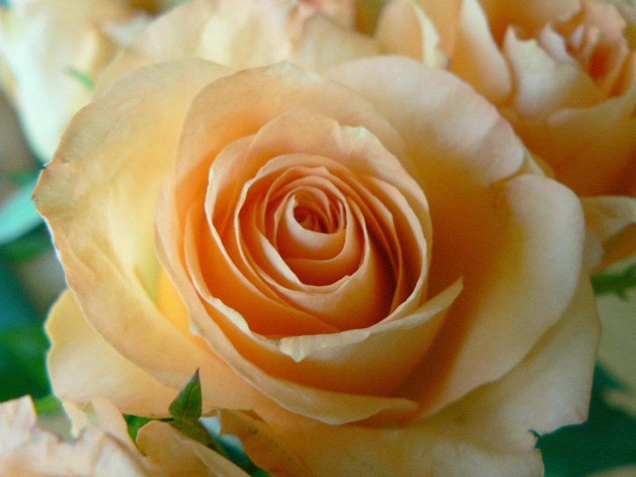
Apricot sits in the orange family, but it is a soft, pale version with a hint of pink-red rather than a bright citrus orange. If you need to specify it for a design, a brand palette or a product, the useful questions are what its exact values are, how those values change between screen and print, and where the shade works best.
- Apricot is a pale orange, close to the salmon subgroup, with the HEX code FBCEB1.
- Its RGB and CMYK values differ by color model, so screen and print will not match exactly.
- Its associations come from orange: warmth, energy and a push toward action.
What color is apricot, exactly?
Apricot belongs to the orange part of the spectrum. More specifically, it falls in the pale orange-red subgroup that is also called salmon. In practice that means a light, warm tone with a peachy, slightly pinkish cast, far from a saturated traffic-cone orange.
A ripe apricot is described as an orange-yellow drupe tinged with red, so the fruit shows a blend of yellow, orange and a touch of red. When designers say apricot, they usually mean the paler, softer end of that range.
Image libraries tag fruit, flowers, fabric and pastel gradients with both words interchangeably, so you cannot rely on the name alone. If a color must be right, specify a code rather than a word.
What are the apricot color codes?
A color model is a numerical way to describe a color. Apricot can be written in several, and each suits a different job.
- HEX: FBCEB1, the format most used in web work.
- RGB: rgb(249, 206, 175), an additive model for screens. That is about 98% red, 81% green and 69% blue.
- CMYK: cmyk(0%, 17%, 29%, 2%), a subtractive model used in printing, with no cyan, 17% magenta, 29% yellow and 2% black.
- HSL: hsl(24, 90%, 84%). The hue sits at 24, the saturation is high, and the lightness is high, which explains the pale look.
Reading the HSL value is the quickest way to understand the shade. A hue of 24 places it in orange territory, and a lightness of 84% pushes it toward white, so you get a tint of orange rather than a deep one.
Note that apricot is not one of the 216 web safe colors.
Will apricot look the same on screen and in print?
Not exactly. RGB and HEX describe light added together on a screen, while CMYK describes ink subtracted from white paper. The two models cover different ranges, so a conversion is an approximation rather than a guarantee.
For a pale, warm tone like apricot, a few habits reduce surprises:
- Pick the CMYK values for anything that will be printed, and the HEX or RGB values for anything on a screen, instead of converting on the fly.
- Request a physical proof on the actual paper or fabric. Pale tints shift noticeably with the substrate and its brightness.
- Check the swatch under the lighting where the final piece will be seen. Soft peachy tones can lean pinker or more yellow depending on the light source.
If apricot has to match across several materials, such as packaging, textile and a website, treat one reference as the master and judge the others against it, accepting a small tolerance.
Where does apricot work in design and branding?
Because apricot is a type of orange, it inherits orange’s associations: energy, cheerfulness, activity and warmth. Orange tends to stimulate action rather than contemplation, which is why it appears in call-to-action elements and is thought to nudge hesitant buyers toward a purchase. It is also common in brands aimed at children and in food-related businesses.
The pale version changes the balance. One caution from the color guidance: lighter variations of orange do not produce the relaxing effect of lighter yellows, and some people find them rather dull. That suggests using apricot where you want warmth without aggression, and pairing it with something stronger when you need emphasis.
- Good fits: backgrounds, soft gradients, packaging for food or children’s products, and warm neutrals in interiors and fashion.
- Needs support: buttons and alerts, where a deeper orange or a darker text color will carry the attention.
Remember that associations are personal. Used creatively, the shade can serve many branding purposes, so test it with the audience you actually have.
Finally, check contrast. A color this light gives weak contrast against white, so use dark text on top of it and verify legibility, including for people with color vision deficiency, who may perceive the shade differently.
Frequently asked questions
Is apricot the same as peach?
They are close and often used interchangeably, especially in stock imagery and fashion copy. Apricot is classed as a pale orange within the salmon range. If you need a precise match, use the color code instead of either name.
What is the hex code for apricot?
The HEX code is FBCEB1. In RGB that is 249, 206, 175, and in CMYK it is 0%, 17%, 29%, 2%.
Is apricot a warm or cool color?
It is warm. It belongs to the orange family, which is linked with warmth, fire and energy, and its slight red tint reinforces that feeling.
Is apricot a web safe color?
No. Web safe colors are a set of 216 shades from the days of limited monitors, and apricot is not among them. Modern screens display it without any problem.
Related reading
- Pantone, RAL, NCS: Making Sense of Colour Reference Systems
- Colour Vision: How the Eye Works, and Colour Blindness
Sources
- Apricot color – Arteqo Consulting (arteqo.com, accessed 2026-11-09)
- Apricot — Wikipédia (en.wikipedia.org, accessed 2026-11-09)
Photo: Apricot colored rose closeup, by Rosendahl, Public domain (Wikimedia Commons)