
Ask what the opposite color of pink is and the quick answer is green. The longer answer is more useful, because pink is not a pure hue, and the green you pick changes the mood of a palette. This guide explains why, then shows how to choose a pairing for fashion, interiors or screen work.
- Pink is a tint of red, so its opposite sits in the green family.
- Pale pinks pair gently with mint tones; saturated pinks need stronger greens to hold their own.
- On screen, an HSL color picker lets you find the opposing hue by shifting the hue value across the wheel.
Why does pink have an opposite at all?
On a traditional color wheel, opposites are called complementary colors. They sit directly across from each other, with pairs such as red and green, blue and orange, or yellow and purple. Pink does not appear on the wheel as its own hue, though. It is classed as a tint: red with white added, which makes it a lighter variation of red.
That detail answers the question. A tint keeps the hue of its parent color, so pink inherits red’s opposite. What changes between them is lightness and intensity, not the direction you travel to find the opposition.
Three terms help when you discuss the result. Hue is the color family, value is how light or dark a color is, and chroma is its vividness. Two colors can share the same hue relationship and still feel very different if their value and chroma differ.
Does the answer change with the color model?
It can. The practical effect is that the green opposite pink may lean slightly bluer or yellower depending on which wheel you consult.
This is why a single fixed answer is risky. Neither result is wrong, but each belongs to its own model. Before you commit to a pairing, decide where the work will live:
- Painting, textiles and printed goods: start from the traditional wheel, then test physical swatches.
- Screens and interfaces: use the model your design software uses, and check the result on an actual display.
- Mixed use: expect the green to shift between the two, and judge the final pairing by eye in each medium.
Perceptual models, which try to describe how people actually see color, add a further layer, but the working rule stays the same: treat the calculated opposite as a starting point, not a verdict.
How do you choose the right green for a pink?
Pink’s complementary partners are green tones such as mint or pale green. That pairing produces strong contrast and makes the pink feel livelier. The decision that matters is how intense each side should be.
Soft pink with soft green
Pale pink next to mint or pale green reads fresh and light. It suits gentle, spring-like work: beauty packaging, bakery branding, light interior accents. The contrast is clear without being aggressive.
Bright pink with deep green
A saturated pink needs a green with enough weight to balance it. Deeper greens give an energetic, natural feel and tend to suit outdoor, wellness or bolder fashion themes. Pairing a vivid pink with a pale green can look washed out, because the pink dominates.
When the opposite is too much
Direct complements are loud. If a palette feels harsh, you have options:
- Reduce the saturation of one color, or both, to keep contrast without the glare.
- Use the green as an accent in small amounts and let pink or a neutral carry most of the surface.
- Move to analogous partners such as rose red or lavender for a calm, unified look.
- Try a triadic scheme that brings in blue and warm yellow for a balanced, cheerful result.
Context decides. There are no absolute rules, so test a few combinations against the audience and the setting.
How do you find the true opposite in a digital tool?
If you work on screen, the most reliable method is to set your color picker to HSL, which describes a color by hue, saturation and lightness. Hue is expressed as a position around a circle.
A workable routine:
- Pick your pink and read its hue value in HSL.
- Shift the hue to the opposite position on the circle, keeping saturation and lightness the same at first.
- Look at the result in context, next to real content, not on an empty canvas.
- Adjust saturation and lightness separately until the green balances the pink instead of fighting it.
Keeping saturation and lightness identical gives a mathematically tidy opposite, but it is rarely the most attractive one. Most finished palettes lower the intensity of one partner or change its lightness. Always verify on a calibrated display when color accuracy matters, since the same values can look different from one screen to another.
Frequently asked questions
What is the complementary color of pink?
Pink is a tint of red, so its complementary color falls in the green family. Mint or pale green suits a soft pink, while deeper greens balance a more saturated one. The exact green depends on which color wheel or model you use.
Is the opposite of pink green or blue?
Green is the usual answer on the color wheel, because pink derives from red. Blue is not opposite but is a useful partner in a triadic scheme, where pink combines with blue and warm yellow for a balanced, lively palette.
Do light pink and hot pink have the same opposite?
They share the same general direction on the wheel, since both come from red. The difference lies in lightness and saturation, so the green you pair with each should be matched in intensity rather than copied from one to the other.
Related reading
- Light Sources: How LED Changed Colour Work
- The Periodic Table Color-Coded: How Element Groups Get Their Hues
Sources
- What Colors Go Well with Pink? (tourboxtech.com, accessed 2026-11-09)
- Colour Theory for the Colour Pink (melissarathmillinery.com, accessed 2026-11-09)
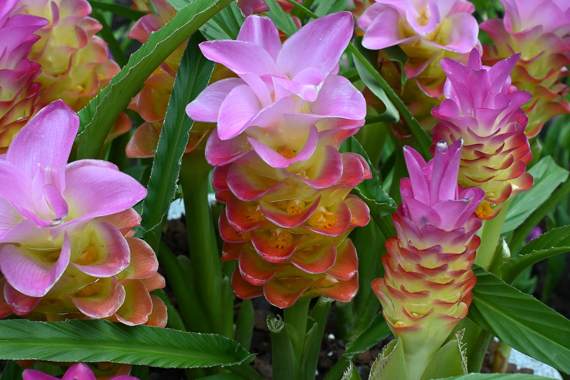
Photo: DFC 6046 Vibrant pink and yellow Siam tulips Curcuma alismatifolia blooming in a cluster their layered bracts contrasting with glossy green , by PattayaPatrol, CC BY-SA 4.0 (Wikimedia Commons)