
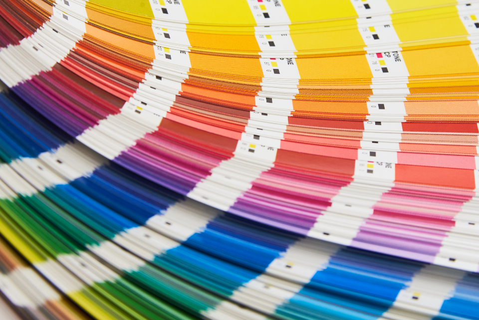
The problem of telling someone else which colour you mean
Colour is a private experience with an urgently public need. A designer in Lisbon has to convey a precise blue to a powder coater in Poland, a fabric mill in Turkey and a printer in Shenzhen, none of whom will ever stand in the same room looking at the same object. Words fail immediately: “sky blue” is not a specification. Colour reference systems exist to close that gap, and there are more of them than most practitioners realise. They are not variations on the same idea. They were built by different industries, for different materials, on different logic, and confusing one for another is the most reliable way to end up with the wrong colour on a real product.
What a colour standard actually is
Every usable colour system is anchored to something physical. Behind the fan deck or the software swatch there is a set of master samples held under controlled conditions, and behind those there is a measurement. Two quite different things get called a standard, and they behave differently.
- A recipe system. Pantone spot colours are formulas: mix these base inks in these proportions and you get this colour on this paper. The number describes how to make it, not where it sits in colour space.
- A collection system. RAL Classic is a numbered set of specific colours chosen by committee for industrial use. The numbers are catalogue entries, with no internal logic connecting one to the next.
- A perceptual system. NCS and Munsell describe colours by how they look to a normal observer, using an ordered notation, so any colour can be located and interpolated whether or not a sample exists.
- A measurement space. CIELAB is not a colour system in this sense at all; it is a coordinate space that any of the above can be measured into, and it is the only common language between them.
Pantone: an ink system that became a lingua franca
Pantone began in the 1960s as a solution to a printing problem. Offset printing reproduces most images from four process inks, but a brand that needs one exact colour on every piece of stationery is better served by a single premixed ink. The Pantone Matching System gave printers a shared numbered library of such spot colours, each with a published mixing formula from a small set of base inks, printed on standardised coated and uncoated stock. The system worked because it removed ambiguity from the one relationship that mattered: designer to printer.
Where it stops working
Its success carried it far outside printing, into places where the underlying logic does not apply. A Pantone number specifies an ink film on paper. It does not specify a powder coating, an injection-moulded polymer, a woven textile or a screen. The company publishes separate libraries for some of these — the TCX cotton system for fashion, plastic chip sets, and the “bridge” guides that show how far a spot colour falls when reproduced in four-colour process — precisely because a single number cannot span them. The other practical issues are mundane but costly: fan decks fade and should be replaced on a schedule; the same number printed on coated and uncoated stock looks like two colours; and the library is proprietary and licensed, which has periodically caused friction when software vendors withdraw built-in support.
RAL: the industrial colour catalogue
RAL originated in Germany in the 1920s as a rationalisation exercise. Rather than let every supplier invent its own shade of postal yellow, a central body defined a limited set of colours with fixed numbers. RAL Classic remains that set: four-digit codes where the first digit indicates a colour family — 1000s yellow, 2000s orange, 3000s red, 5000s blue, 6000s green, 7000s grey, 9000s white and black — and the remaining digits are simply sequence, not gradation.
- Its natural home is coatings. RAL is the default for powder coating, architectural metalwork, machinery, road and rail infrastructure across much of Europe.
- Gloss is part of the standard. The reference collections are issued in semi-matt and high-gloss versions because the same pigment at different gloss levels measures and looks different.
- The extensions are different animals. RAL Design System+ is a systematic space organised on hue, lightness and chroma coordinates, with far more colours and no relation to the Classic numbering; RAL Effect covers waterborne and metallic ranges.
- Its limitation is coverage. Around two hundred Classic colours is a small palette, and it is heavily weighted towards the industrial and infrastructural rather than the decorative.
NCS: describing what the eye reports
The Natural Colour System takes the opposite approach. Rather than cataloguing available colours, it models perception. It rests on six elementary colours that observers describe as pure and unmixed — white, black, yellow, red, blue and green — and specifies any colour by how much it resembles each. The notation looks cryptic and is in fact very readable once decoded: S 1050-Y90R means ten per cent blackness, fifty per cent chromaticness, and a hue ninety per cent of the way from yellow towards red, which is to say a strong clean red.
The advantage is that the notation carries meaning. A specifier can adjust a colour deliberately — take the blackness up, take the chromaticness down — and predict the result without a fan deck. That is why NCS dominates architecture, interior specification and paint retail across Scandinavia and has spread through European architectural practice. Its weakness is the mirror of its strength: because it describes appearance rather than material, an NCS notation says nothing about how to achieve the colour in a given medium, and some notations are simply not attainable in a durable exterior paint.
Munsell and the systems behind the systems
Albert Munsell, a painter and teacher, published his system in the early twentieth century to give art students an orderly way to talk about colour. He separated it into three independent dimensions — hue, value and chroma — and arranged samples so that steps between neighbours were perceptually equal. That principle underlies essentially every perceptual system since, including CIELAB. Munsell notation is still in daily working use in fields far from design: soil science, geology, forensic description, food quality grading and dentistry all use Munsell charts because the ordering makes intermediate judgements possible.
- British Standard 4800. A national construction palette, still specified in UK building work and mapped to the older BS 381C range used for signage and equipment.
- Federal Standard 595. The US government coating reference, familiar to anyone who has painted a military model kit, organised by gloss level and number.
- DIC and Toyo. Japanese printing ink systems widely used in Asian print production, with their own numbered libraries and no interchangeability with Pantone.
- Proprietary paint decks. The colour cards of major architectural paint brands function as de facto standards for interiors and are how most decorating colour is actually specified.
Why conversion charts lie
The single most damaging misunderstanding in this field is that these systems are dialects of one language and can be translated. They cannot, at least not without loss. A conversion table offering a RAL equivalent for a Pantone number is giving the nearest available entry in a small catalogue to a colour defined as an ink film. Sometimes the nearest is close; often it is visibly wrong, and the table does not tell you which case you are in.
The honest procedure is to go through measurement. Measure the physical standard with a spectrophotometer under a defined illuminant and observer, record the CIELAB values, and give the supplier both the reference number and the measured coordinates with a stated tolerance. That makes the target unambiguous and gives a basis for acceptance. It also exposes when a target is unreachable in the destination medium, which is far better discovered at specification stage than at first production run.
How standards degrade in the real world
Reference systems fail quietly, and almost always through neglect of the physical artefacts rather than any flaw in the system itself.
- Fan decks age. Guides left on a sunlit desk shift measurably within a year; most publishers recommend annual replacement and most studios ignore it.
- Batch variation is real. Even reference collections are manufactured, and successive printings of the same guide are held to a tolerance, not to identity.
- Screen simulation misleads. The on-screen swatch labelled with a system number is a rendering, not the colour, and it varies with the display and the colour management chain.
- Undocumented substitution. Suppliers asked for an unavailable colour often deliver their closest stock alternative without saying so, which surfaces only when two production batches sit side by side.
Choosing a system and using it well
The practical rule is to let the material choose the system. Print and packaging speak Pantone. Powder-coated metal and architectural hardware speak RAL. Architectural paint and interior specification, particularly in Europe, speak NCS. Textiles need a textile standard and ideally a physical dyed swatch. Plastics need a moulded chip in the actual polymer. Working in the system native to the medium removes an entire layer of translation error.
Where a brand colour must cross several media, the durable approach is to define a master — a measured CIELAB value with a tolerance, plus a physical reference artefact held centrally — and then derive a native specification for each medium from that master, approving each against a real sample. It is slower than issuing one number to every supplier, and it is the only method that produces a coherent identity across a printed carton, a moulded lid, a coated shelf unit and a woven label.