
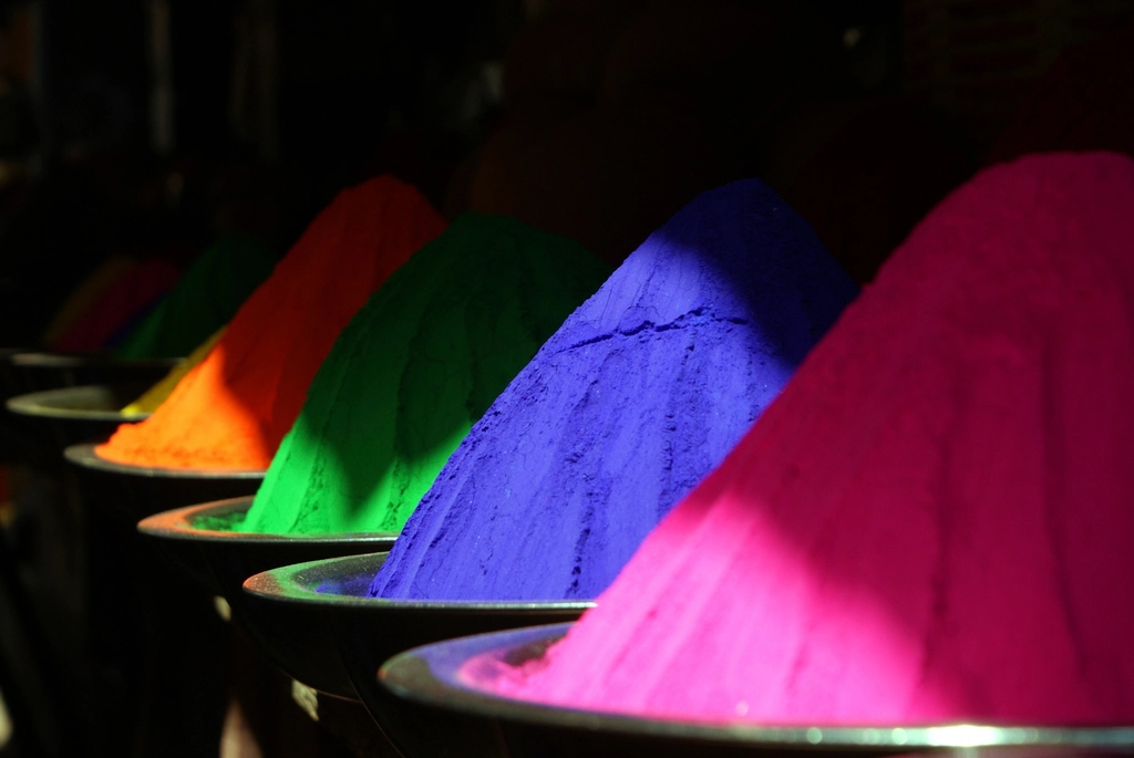
The colour of mourning depends where you are standing
Ask a European audience what colour signifies death and grief, and nearly everyone will say black. Ask across much of East and South Asia and the answer is white. Both groups will feel that their answer is somehow natural — that black is heavy and final, that white is the emptiness of absence. Both are describing a convention they absorbed before they could read, and mistaking it for a fact about colour.
This gap matters commercially and practically. Brands have launched packaging into markets where the colour said something they never intended. Interfaces have used a red that meant danger in one country and prosperity in another. Understanding where colour meaning comes from — and how much of it is genuinely shared — is a working requirement for anyone designing for more than one audience.
What actually is shared
Cultural relativism can be overstated. Some things about colour do appear broadly, and it is worth being precise about which.
- Basic colour term order. Cross-linguistic research found that languages acquire basic colour words in a strikingly consistent sequence: dark and light first, then red, then green and yellow, then blue, then brown, then the remainder. The specific findings have been challenged and refined for decades, but the broad pattern of red arriving early has held up well.
- Focal colours. Speakers of very different languages tend to pick similar best examples of red, green, blue and yellow, even when their languages divide the spectrum differently. The boundaries move between cultures; the centres move less.
- Warm and cool. The association of long-wavelength colours with warmth and short-wavelength with coolness is widespread, plausibly grounded in fire, sun, water and shade.
- Arousal effects. Highly saturated colours are generally rated as more activating than muted ones. This is a fairly robust perceptual effect, distinct from any meaning attached to a particular hue.
What is emphatically not shared is the interpretive layer: what red means, what a colour is appropriate for, what it implies about a person wearing it. That layer is built from local history, religion, materials, trade and language, and it differs enormously.
Where meanings come from
Material scarcity
Before synthetic dyes, colour meaning tracked cost with almost embarrassing directness. Tyrian purple was extracted from marine molluscs in quantities that required thousands of animals for a small amount of dye, so purple became the colour of Roman and later Byzantine authority — not because purple is inherently regal, but because almost nobody could afford it. Ultramarine came from lapis lazuli mined in what is now Afghanistan and cost more than gold by weight, which is why medieval contracts specified how much of it a painter would use on the Virgin’s robe. The blue was a display of the patron’s expenditure as much as a devotional choice.
When synthesis made these colours cheap in the nineteenth century, the meanings did not vanish but they did thin out. Purple retains a faint ceremonial residue; mauve, the first commercially successful synthetic dye, went from sensational novelty to unremarkable within a couple of decades.
Religion and ritual
Saffron and orange carry deep significance in Hindu and Buddhist contexts, associated with renunciation and with the robes of monastic orders. Green has strong positive associations across the Islamic world with roots in religious tradition. White in many East Asian funerary contexts signals mourning and purity simultaneously. These associations are ancient, load-bearing and not casually overridden by a marketing campaign.
Politics and recent history
Colour meanings can be created within a generation. Party colours, flag colours and protest colours attach quickly and stick hard. A colour that is politically neutral in one country can be unusable in another because a party or movement owns it. This is one of the fastest-moving categories of colour meaning and the one most easily missed by a designer researching a market from the outside.
Language itself
Languages carve the spectrum differently. Russian has separate basic terms for lighter and darker blue, and speakers are measurably faster at discriminating across that boundary. Several languages historically used one term covering green and blue together. Japanese ao traditionally spanned a range including what English calls green, which is why a Japanese traffic signal is described with the word for blue while being green. Where the boundary falls affects what people notice and how they describe it.
Case studies in getting it wrong
- White packaging in East Asia. A minimal white-and-black aesthetic that reads as premium and clean in Northern Europe can carry funerary associations elsewhere. The fix is rarely to abandon minimalism but to shift the neutral — warm off-white, cream, or a coloured accent that resets the reading.
- Red as danger versus red as fortune. Red signals warning, error and stop across much Western interface convention. In Chinese contexts it carries strong associations with luck, celebration and prosperity, and it appears on financial displays for rising values, inverting the Western convention where red means loss.
- Green as environmental virtue. Widely legible in Europe and North America, less automatic elsewhere, and in some contexts green carries specific religious weight that makes casual commercial use inappropriate.
- Gendered pastels. The pink-for-girls, blue-for-boys convention is barely a century old in its current form, was for a period reversed in some Western guidance, and is far from universal. Treating it as natural rather than as a recent local convention is a common and avoidable error.
- Purple in mourning contexts. In parts of Latin America and Catholic Europe, purple carries associations with Lent and mourning that make it a poor choice for celebratory packaging.
Colour as a rule about who you are
For most of recorded history, colour was not a free choice. Sumptuary laws across medieval and early modern Europe specified which colours which social ranks could wear, and enforcement was real. Scarlet and purple were reserved for nobility and senior clergy in various jurisdictions; merchants who dressed above their station could be fined. Similar restrictions appear well beyond Europe, notably in imperial China, where particular yellows were reserved for the emperor.
These rules did not survive, but the instinct did. Colour still marks group membership with remarkable efficiency.
- Uniform and profession. Surgical greens and blues, high-visibility yellow, judicial black, the specific navy of a given service. These read instantly within a culture and often mean nothing outside it.
- Team and tribe. Club colours generate loyalty and antagonism that is entirely arbitrary in origin and entirely serious in effect. In some cities wearing the wrong shirt in the wrong street is genuinely unwise.
- Subculture. Colour has repeatedly been used to signal affiliation, from mod and punk palettes to the specific desaturated ranges of successive outdoor and streetwear movements.
- Class signalling through restraint. In many contemporary Western contexts, the high-status signal is a narrow range of expensive neutrals rather than any bright colour — an inversion of the sumptuary logic, where visible saturation now reads as inexpensive.
- Ceremonial dress. Wedding colours vary enormously: the Western white gown is a nineteenth-century fashion that spread with empire and cinema, while red remains the traditional bridal colour across large parts of Asia.
Why the research is thinner than the infographics suggest
Search for colour meaning and you will find neat charts assigning one emotion per hue per country. Treat them with suspicion. Several problems recur.
- Hue is not a colour. “Red” covers everything from a dusty brick to a fluorescent scarlet. Lightness and chroma change meaning at least as much as hue does. A chart that names a hue and nothing else has discarded most of the information.
- Context dominates. The same green means one thing on a pharmacy sign, another on a football shirt and another on a bank statement. Meaning lives in the pairing of colour and category, not in colour alone.
- Sample bias. A great deal of colour psychology rests on studies of university students in a handful of wealthy countries, generalised well past what the data supports.
- Effect sizes are modest. Claims that a particular button colour lifts conversion by a fixed percentage rarely survive replication. Contrast, hierarchy and clarity usually explain more than hue.
- Meanings drift. Associations change within decades. Any static chart is a snapshot presented as a law.
A workable method for cross-cultural colour
The point is not to be paralysed. It is to replace assumed universality with a small amount of deliberate checking.
- Separate function from expression. Functional colour — error states, required fields, warnings — should be reinforced with icons and text so that it works regardless of local reading. Expressive colour can then carry brand personality without bearing the whole communicative load.
- Research the category, not the country. Ask what colours competitors and adjacent institutions use in that market. Local category conventions are more actionable than national stereotypes.
- Check the hard edges. Mourning, religion, politics and national symbols are where mistakes are costly and irreversible. These are worth an explicit review by someone local.
- Ask about the specific colour. Show the actual swatch in the actual application, not the word for the hue. Reactions to a real muted olive have little to do with reactions to the word green.
- Allow regional variation. A brand system that permits a different accent or neutral per market is more robust than one that insists on a single global palette and then discovers a problem after launch.
The deeper habit worth building is noticing when a colour association feels self-evident. That feeling of obviousness is exactly the signal that a convention has been learned so early it has become invisible — and it is a reliable indicator that somewhere, a large number of people learned a different one just as thoroughly.